Rebe LUX Logo Design Process
ideation
During an initial client intake meeting I determined the client’s vision, visual aesthetic and target demographic. I began the logo design process by exploring logotype in black and white. The client envisioned a logo that was feminine, chic and sophisticated.
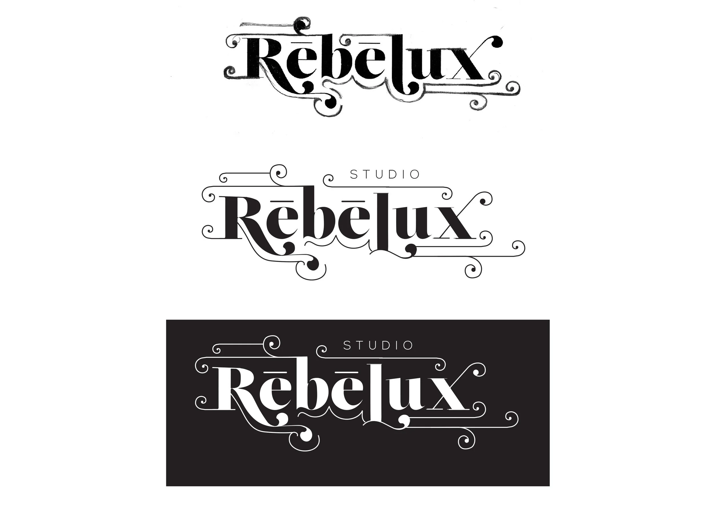
first round of design: exploration of type and shape in black and white
I embellished a typeface by hand and refined it digitally (below). This early iteration was ultimately terminated by the client. However, it remains my personal favorite; it’s delicate, feminine and a little Steampunk.
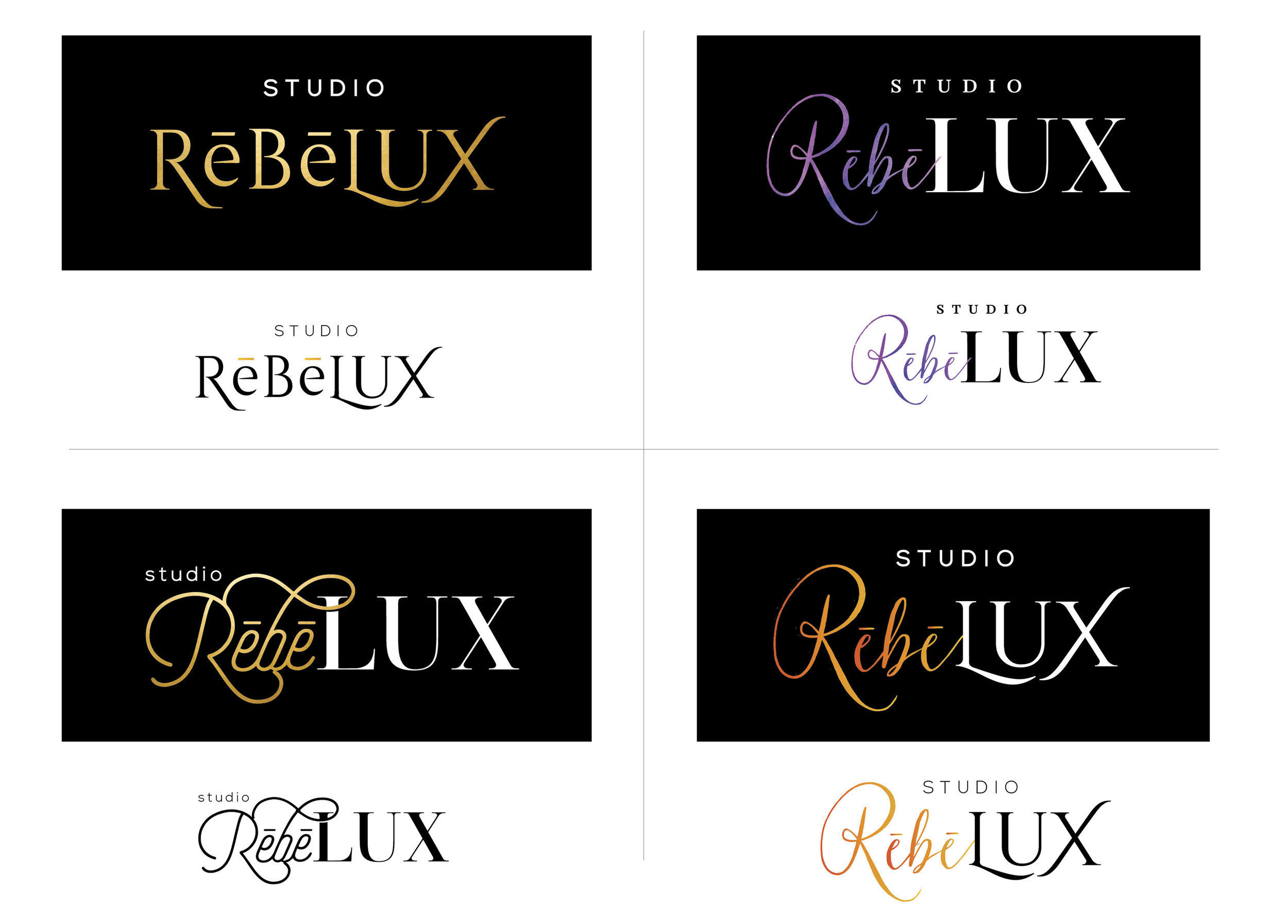
second round of design: introduction of color and refinement of logo
In the next iteration of this design, I incorporated client feedback was and began to explore color.
The client wanted to be “on trend” and at the time gold foil printed collateral was very popular. It was also the beginning of the “ombre hair” trend. Both of these color pallets were discussed in the intake meeting. I created a miniature moodboard (pictured below) to illustrate some of the ways these color directions could play out.

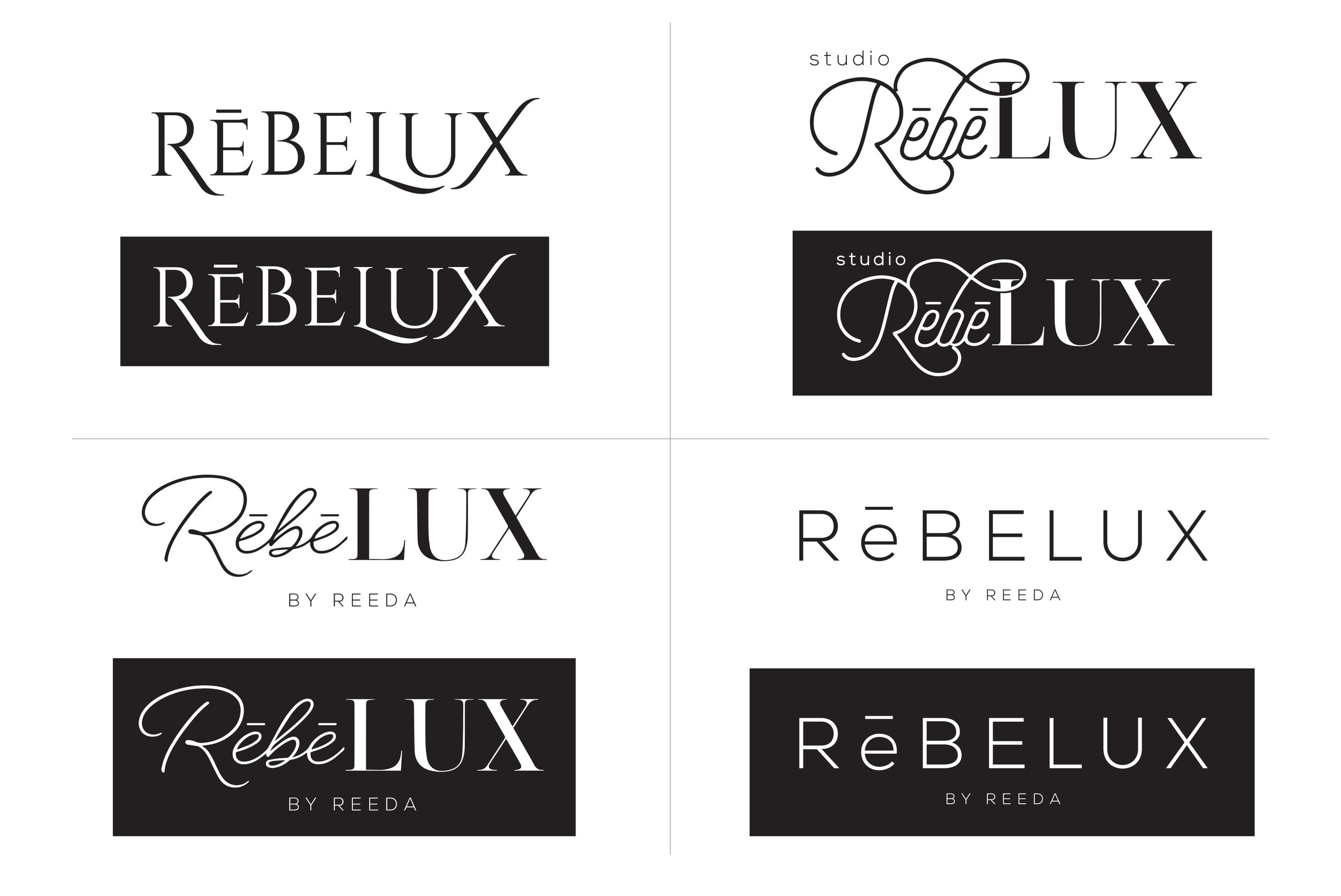
In the first round of design, the client identified which elements she was drawn to and we discussed why. She particularly liked the concepts in which “Rebe” stood apart from “LUX”. In this next set of concepts I remixed certain elements and presented a breadth of solutions.
final design
The final logo was born out of a combination of three of the above compositions.

Once the logo was finalized, I designed business cards, appointment cards and a store front sign.
insights
This project was a huge success. This brand is meant to be a reflection of the owner’s taste. She was involved in the decision-making throughout and is ecstatic over the final result.
This project coincided with the planning of my wedding, and as a result I became all too familiar with the competitive market for hair and make-up professionals. I can confidently say, the RebeLUX brand is elevated among the rest. It is sleek and sophisticated and pays homage to Rebecca’s (Rebe’s) gilded skill.